All That Glitters — Duskmourn: House of Horror

Hunter Ball • November 12, 2024
Hello and welcome all to this inaugural issue of All That Glitters, the foils’ set review. In this issue we’re tailing the end of this year's spooky season by looking at one of Magic’s latest sets, Duskmourn: House of Horror, an enchantment-themed set with quite a few unique alterations and variations contained within. Will they be as hauntingly delicious as my family’s famous crunchy candy apples? Or are these the dental floss of foils? Lets look within…
I'm Hunter and I’ll be guiding you through my foil folio and giving an honest review of the card quality across the set. These are my opinions, and as a kooky candle crunching Irreverent Gremlin myself, do not disallow your love of a card to be dissuaded by what I have to say. Instead, use this as a frank and honest way to evaluate your cardboard before you buy.
I'm fascinated by all things both cardboard and metallic, both rectangular and holographic, and as such I intend to investigate what horrors lay within these haunted halls, and maybe, just maybe, help you decipher which among these spooktacular spectacles are worth adding to your collection.
Duskmourn Visual Review
We're grading these cards on four categories:
- Brightness, or how much of the art and frame obscures the foil treatment;
- Luster, the strength of any colorful or prismatic effects in the card;
- Visibility, if the foil effect causes any reduction in art or text clarity;
- and finally overall Print Quality.
We have several modes to evaluate with Duskmourn:
- the core set,
- the full art lands,
- the unique TV-framed Showcases,
- several borderless variants including the iconic Giving Chase! cards (with art of several nightmarish creatures giving those trapped within a run for their money),
- and lastly the unique character focused “Double Exposure” treatments and their textured finishes.
The Horror of… Pringling!
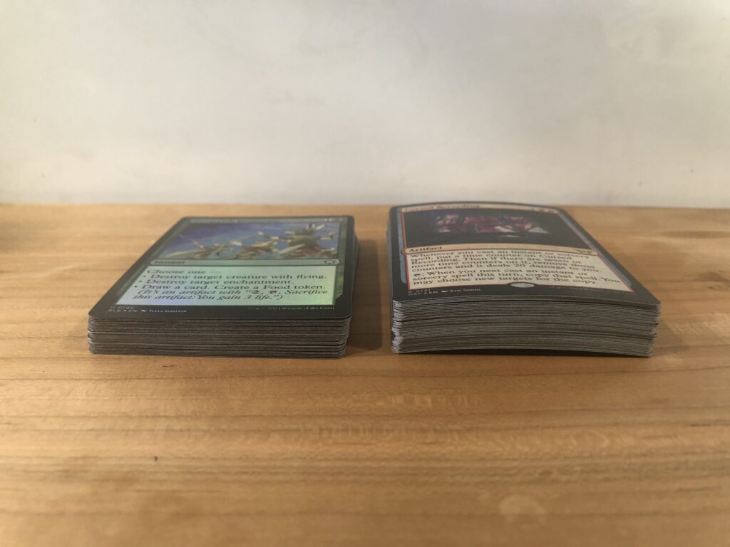
I wanted to start this set review off with a cautionary disclaimer of Duskmourn cards and "pringling" (this refers to the tendency of foil cards to curl once exposed to air, often in the shape of a Pringles potato chip). This may only be our first article, but this has been a recurrent super-villain that all us fellow foil foragers have encountered time and time again, and Duskmourn is no exception.
Corollary to our category of Print Quality, Duskmourn has some of the worst pringling I've ever seen from a set. Barring buying punctured packs that sat in a toasty sun-lit countertop for several months, these foils began to bend almost immediately upon opening, and the effect is dramatic. The cards feel unusually stiffer than other foils of the past and have quite a bit of spring to them. So while in any other circumstance I would normally advise a bit of thumb pressure and double-sleeving, these cards have quite a bit of bounce and do not want to go down easily. As I get further into the review of specific qualities of the art and treatment, this is going to veil the entire set with the specter of low-quality cardboard.
DSK Base Set
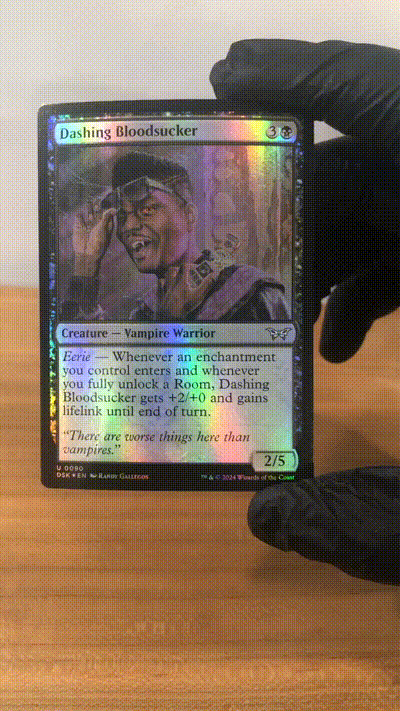
Examples like Overgrown Zealot and Dashing Bloodsucker really fall flat on their face, the images almost entirely mirror polished surfaces with scant details, in some ways going as far as to then invade upon the silhouettes of the subjects, Dashing Bloodsucker’s gadget breaking up the look of its collar and confusing the entire portrait. My prescription is to avoid any foils where you can clearly see the background take a broadly similar color palette, as more than likely you’re going to lose a significant portion of that in the foiling.
TV Frame and Giving Chase! Showcases
The TV frame showcases are a huge improvement. As with any premium or rarer collectable, the art here feels much more intentional. The most immediate change is the switch from black text on a bright and reflective background to white text on a typically darker background; the change means that while the cards in this edition are equally as bright and reflective, the luster is more visible in contrast, and the cards lose a lot less readability.
Regardless of the specific card you seek in this collection, there are still things here for you: here, each color is framed in a colorful array of buttons, switches, and other greebles on the rightmost side of the art frame, which each offer something unique and visual to look at. Metallics shine, energy pops, and a unique art decision is to have the visual TV-static in places an island of non-reflective surfaces, so at all angles there is something interesting to look at. While these still lose points to the dreaded pringling, I recommend anyone give these a look over and add to your collection.
The Giving Chase! Showcases are a unique collection of seven borderless alternate art printings of seven iconic creatures from the set, each set in motion at their respective hapless victims. While each card is mechanically powerful, the art style here visually varies: specifically Silent Hallcreeper and Screaming Nemesis fail to break the mold from other alternate art foils, while the other five are far more visually striking and recognizable. But due to the limited nature of this series, I can’t rate them with absolute confidence: if you like the series, collect them all – if you're looking for a mechanically unique powerhouse for your deck, these are a good way to flag to your fellows their time is closing in.
Double Exposure Legends
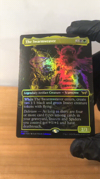
The art is fascinating, and to date is very likely one of the strongest and most interesting art styles tested on a Magic card. Starting off from the edge and moving inward is something unique about these “Borderless” art cards. While in most Magic: the Gathering foils the thick black outer border is filled in and the sharpest point of non-reflective surface, here it feels that they've taken advantage of that printing technique and filled in all dark spaces with that same depth of sharp contrast, thus allowing the art deeper inward to actually shine.
But, to my shame (forgive me Nashi!) I don't think this is a high-scoring execution. To that point: our roguish hero of the set is a visual mess. It's still unclear to me what the second image appearing in Nashi’s art is, and the foil treatment as it appears here in no way helps this imagery. Several of the cards are strong successes. The Swarmweaver, while lacking in some strong undercut metaphor about the inner turmoil of the character, is very clear in its imagery: it's a bee and a wicker-creature. Kona, Rescue Beastie is both a playful beast and a monster under the mask, and we see that subtle dichotomy here.
While this art style is a breath of fresh air and a sign that the art team is willing to be experimental, the name of the game with Duskmourn thus far has been amazing taste, middling execution.
…On the Subject of Textured and Fractured Foils
![]()
Conclusions
Duskmourn has done quite a lot right, but as with many of the nightmares creeping around its every corner, the sins of the past have come to haunt it– and while history is not doomed to repeat itself in the future, it has repeated itself here. Substandard cardboard is not a death sentence to sets past (which is a subject I hope to cover more in the future), but for the time being Duskmourn fulfilled its destiny by being the campy yet quaint toe-dip into the horror genre that I hope we see more of in the future.